
Commercializing Color
How Pantone won the color game
Pick up the closest thing to you right now. What color is it? Oh, red you say? Cool. What type of red? Ok, apple red, but which kind – McIntosh, Red Delicious, Gala? As you can see, this is a pretty inefficient process. In fact, we can go back and forth all day and I probably still will end up visualizing a different color than what you see in front of you.
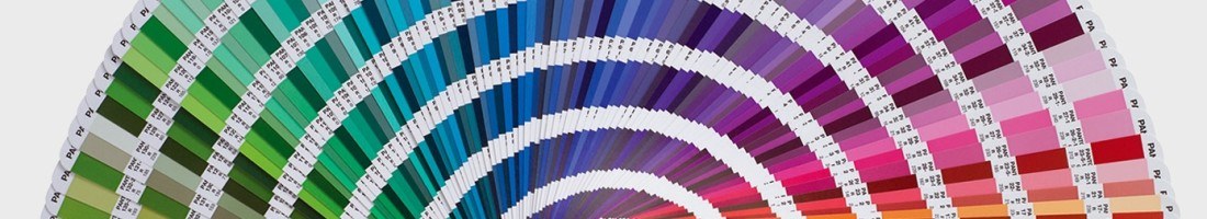
Frustrated by similar experiences as described above, graphic designer, Lawrence Herbert, created the Pantone Color Matching System in 1963 to standardize the language of color. Color identification is subjective due to the fact that we all perceive color differently. These differences can be caused by biological (color blindness), psychological (how colors make us feel), and physical (lighting) factors. What Pantone set out to do was make color an objective process through the use of controlled environments and a naming system, which allows people to communicate color precisely. For over 50 years, Pantone has been the undisputed source for all things color. And, the coolest part is that this is a self-declared titled earned by capturing and creating value in a space that had not been commercialized before.
Color is usually the first thing that pops out for any consumer facing product, whether it’s hardware or software. Color also plays a vital role in brand recognition and marketing – think iconic Tiffany blue. Therefore, it’s important that companies are able to consistently deliver the same user experience through color every time. Pantone allows them to do this. For example, if I give my supplier Pantone chip “19-1663”, we can both save time and money by avoiding multiple rounds of approval on color matching. Suppliers and distributors both recognize this benefit, which is where Pantone captures value. They have continued to do a great job of staying relevant over the years by working with software editing programs to translate physical Pantone chips to digital ones.
Further, the emphasis of color matching brought about by Pantone has allowed them to create value in the sense that they are now an industry standard, so everyone has to stay abreast to their data. Companies all over the world buy Pantone color books to communicate over 1000 different colors internally and externally. What’s more is that Pantone leverages their reputation as being the color masters by having a whole section devoted to trends. Designers look to Pantone for color reports to forecast next season’s hottest hues. The Pantone Color Institute also serves as a consultant agency that provides advice on color trends and selections. They are even known for working with companies on establishing new Pantone colors exclusively for their brands i.e. Minion Yellow.
In summary, Pantone captured value by solving a problem and in term created value by making their solution the only option in the market. This self-fulfilling cycle coupled by the fact that there is no rival company makes them a winner.

Think all of this color stuff is easy? Try this color test before you make up your mind.